Branding Guidelines for Verosoft
Scalable Asset Management
Purpose of the guidelines
The purpose of these branding guidelines is to ensure a consistent and professional representation of the Verosoft brand across all touchpoints.
By defining clear rules for the usage of our logo, colors, typography, and associated design elements, these guidelines help protect the integrity of our brand identity and foster recognition in the marketplace.
A cohesive visual identity builds trust and reinforces our values. Whether the logo is used on a website, social media post, sales sheet, internal document, or promotional product, adherence to these guidelines ensures our brand remains memorable, recognizable, and aligned with our mission.
Primary Logo
The two brackets symbolize progress and innovation. They represent an arrow pointing forward, signifying the evolving nature of Verosoft and its solutions, as well as the transition toward a more innovative and upward-moving world—a metaphor for growth and continuous improvement.
The first bracket serves as a cornerstone, representing Verosoft as a foundation of support for its clients. The second bracket symbolizes the clients who, with Verosoft’s assistance, thrive and advance toward success.
Additionally, the brackets subtly evoke French quotation marks, paying homage to the company’s Quebecois and Canadian origins.




Logo variations
For optimal usage, our primary logo should take precedence and be prominently displayed on a suitably contrasting background. But an inverse or negative logo is also available for darker backgrounds. As well, a submark version is available for compact spaces, such as social media profiles or favicon use, where the full logo may not fit effectively.
Logo safe zones
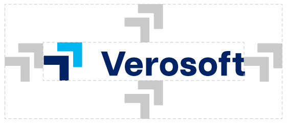
To allow our logo to have room to breathe, it is important to maintain clear space around it at all times. Keep a zone clear around the logo equivalent to the size of the “>>”.
Logo Usage
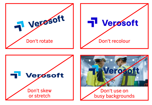
To ensure consistency and create a unified brand experience, the logo must be utilized correctly.
Typography
Sole is our primary font, embraced by designers and creatives. Its elegance and modern style enhance our brand's aesthetic appeal. As the go-to choice, Sole embodies our commitment to creativity and design excellence. When unavailable, our secondary font, Arial, maintains consistency and professionalism.


Logo colors
This combination of dark navy blue and electric blue is ideal for the Verosoft logo to balance professionalism and innovation. The richness of the dark navy blue creates a strong, dependable foundation, and the electric blue adds a dynamic and modern accent, drawing attention to the submark and reflecting energy and forward-thinking solutions. Together, these colors create a memorable logo that resonates, ensuring versatility across all branding touchpoints.
Dark navy blue
HEX: #002366
RGB: 0,35,102
CYMK: 100,66,0,60
Pantone: 280 C
Electric blue
HEX: #00b6f1
RGB: 0,182,241
CYMK: 100,24,0,5
Pantone: 306 C
Branding Colors
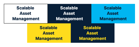
This palette combines white, deep navy blue, electric blue, and bold yellow. The navy blue anchors the brand with trust and authority, while the electric blue and yellow add energy and innovation. Together, these colors reflect Verosoft’s balance of reliability, innovation, and approachability across all branding platforms.
White
HEX: #FFFFFF
RGB: 255, 255, 255
CYMK: 0, 0, 0, 0
Deep navy blue
HEX: #081f38
RGB: 8, 31, 56
CYMK: 86, 45, 0, 78
Pantone: 289 C
Electric Blue
HEX: #00b6f1
RGB: 0, 182, 241
CYMK: 100, 24, 0, 5
Pantone: 306 C
Bold yellow
HEX: #ffdc1d
RGB: 255, 220, 29
CYMK: 0, 14, 89, 0
Pantone: 115 C
High contrast
Not enough contrast
Adittional elements
A navy-to-black gradient to create a modern, professional identity. The gradient introduces dimension for versatile applications.
A navy-to-black gradient to create a modern, professional identity. The gradient introduces dimension for versatile applications.
Applications

Have questions?
If you have any questions or need more assets, please don’t hesitate to reach out to Marketing at marketing@verosoftdesign.com. We’re here to help ensure that the Verosoft brand is represented accurately and consistently.
Access marketing assets
Employees
Looking for the latest marketing assets? All updated logos, branding files, and related materials are available in our SharePoint site.
Partners
Looking for Verosoft logos? Download them below!